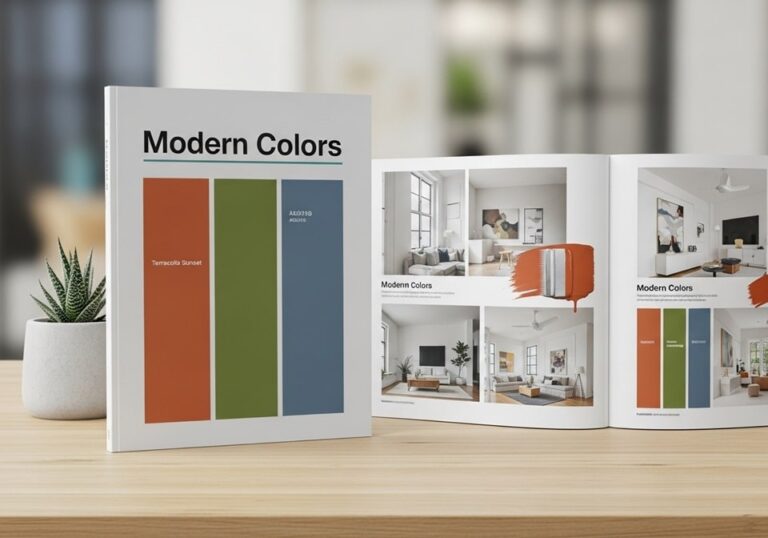
Color is more than visual appeal—it’s communication, psychology, and design precision combined. Understanding modern color palettes is essential for artists, graphic designers, marketers, and anyone involved in creative production. A well-curated modern color palette booklet serves as a professional resource that organizes harmonious color schemes, brand-ready tones, and visually balanced combinations for digital and print use. This step-by-step guide will help you build your own booklet of modern color palettes, blending theory with practical applications to create stylish, consistent, and professional results across media.
Modern design relies heavily on well-chosen color schemes to evoke emotion, ensure accessibility, and maintain visual consistency across digital and print materials. With the right structure, your modern color palette booklet becomes a reliable reference that guides every creative decision—whether you are designing a website, crafting a corporate identity, or preparing marketing materials.
Understanding Modern Color Theory
Before creating your color palette booklet, it’s important to understand how color theory has evolved. Modern color theory is grounded in scientific, psychological, and aesthetic principles that define how colors interact. Designers today use color harmonies derived from the color wheel—combinations like analogous, complementary, triadic, and monochromatic—to achieve visual balance.
The Psychology Behind Color
Each color carries emotional weight and cultural significance. For example, blue represents trust and stability, making it ideal for technology or finance brands, while orange signals enthusiasm and creativity. Color psychology remains a cornerstone in modern marketing strategies, helping brands influence consumer perception effectively.
- Blue: Associated with reliability and intelligence, often used by corporate and tech firms to inspire confidence.
- Red: Represents passion, excitement, and urgency, common in entertainment and retail branding.
- Green: Symbolizes nature, growth, and balance, used in eco-friendly and wellness industries.
- Yellow: Conveys optimism and energy, ideal for brands promoting positivity or creativity.
- Black and White: Represent sophistication and simplicity, essential for minimalist modern designs.
Digital vs. Print Color Models
In digital design, the RGB (Red, Green, Blue) model is standard, while CMYK (Cyan, Magenta, Yellow, Black) is essential for printing. When developing a modern color palette booklet, always define both RGB and CMYK equivalents to ensure visual consistency across screens and print outputs. Adding hexadecimal codes for web applications ensures full cross-platform usability.
Planning Your Color Palette Booklet
Creating a modern color palette booklet starts with defining your purpose. Whether it’s for branding, interior design, digital products, or educational reference, your goal determines structure and color selection. Each palette should tell a story that aligns with the theme of the booklet—modern simplicity, luxury minimalism, tech vibrancy, or organic calmness.
Defining Your Objective
Ask yourself what your booklet will accomplish. Are you compiling it for client presentations, teaching materials, or personal creative use? Your end purpose will influence layout, number of palettes, and visual hierarchy. A booklet for brand strategy, for example, will focus on versatile, balanced combinations that can adapt across various marketing channels.
Gathering Inspiration
Inspiration can come from anywhere—nature, fashion, art galleries, or modern architecture. Popular resources such as Adobe Color, Coolors.co, and Pantone Trends provide insights into current design movements. These sources highlight color combinations gaining traction in marketing, product packaging, and social media branding.
- Nature and Landscapes: Earth tones, sky gradients, and organic greens bring calming aesthetics.
- Technology and Innovation: Cool blues, metallic silvers, and vibrant neons express energy and progress.
- Minimalist Design: Monochrome palettes emphasize clarity and sophistication.
- Retro Revival: Muted pastels and nostalgic warm hues evoke familiarity and comfort.
- Luxury Branding: Deep jewel tones paired with metallic accents signal exclusivity.
Building the Color Palettes
Once the purpose is clear, it’s time to assemble your color sets. Each palette should consist of 4–6 core colors with defined use cases—primary, secondary, and accent tones. Using design software like Adobe Illustrator, Figma, or Canva helps organize and label colors precisely for reproducibility.
Steps to Create Balanced Palettes
- Start with a Base Color: Choose one main color that reflects your theme’s essence.
- Add Supporting Hues: Introduce complementary or analogous colors to enhance harmony.
- Define Neutrals: Integrate grays, whites, or muted browns to balance saturation.
- Check Accessibility: Ensure all color combinations meet contrast standards for readability.
- Test in Context: Apply your palette to mockups or sample designs before finalizing.
Using Modern Tools for Palette Creation
Today’s design technology simplifies palette creation through advanced algorithms and AI tools. Adobe Color’s “Extract Theme” feature, for instance, can generate palettes from uploaded images, while Figma’s plugin libraries let designers test combinations instantly across UI elements. These digital tools ensure accuracy and speed without sacrificing creativity.
Designing the Layout of the Booklet
The design structure of your booklet plays a major role in how users experience color. Clean layouts, consistent labeling, and clear hierarchy make navigation effortless. Every page should maintain a uniform grid system with dedicated sections for palette samples, names, and technical specifications (RGB, CMYK, HEX).
Structuring Your Booklet
- Title Page: Introduce the theme and include your name or brand identity.
- Table of Contents: Offer a clear roadmap for each color family or design style covered.
- Palette Pages: Display each color group with use cases and background variations.
- Application Examples: Showcase how each palette works in different media formats.
- Reference Section: Include additional notes, color codes, and adjustment tips.
Typography and Layout Choices
Use modern, legible sans-serif typefaces like Helvetica Neue, Lato, or Inter for readability. Maintain sufficient white space to highlight colors without visual clutter. Consistency is key—align margins and maintain equal spacing between color blocks for a polished professional appearance.
Choosing the Right Tools and Software
Digital creation tools form the backbone of a professional color palette booklet. Each software offers unique strengths depending on whether your focus is print design, branding, or digital interface design. Understanding their benefits ensures efficiency and consistent quality.
Popular Software Options
- Adobe Illustrator: Industry standard for vector graphics and precise color management.
- Adobe InDesign: Best for creating multipage layouts and print-ready booklets.
- Figma: Ideal for collaborative palette testing in digital design environments.
- Canva: Simplified option for quick mockups or personal design projects.
- Procreate: Useful for digital artists needing intuitive color blending tools.
Color Consistency Across Platforms
When exporting your booklet, verify color integrity across multiple formats (PDF, PNG, and JPEG). Always embed ICC color profiles to maintain accurate color reproduction between monitors and printers. Professional designers also recommend soft-proofing techniques to preview color shifts before final print.
Practical Applications and Industry Relevance
Modern color palette booklets are invaluable beyond design classrooms. They have widespread applications in marketing, architecture, web design, and product development. Corporations use them to standardize branding, ensuring that all digital and print assets maintain consistent visual identity.
Applications Across Industries
- Branding and Marketing: Ensures cohesive identity across logos, websites, and ads.
- Interior Design: Assists designers in visualizing complementary materials and textures.
- Web Development: Supports accessible and engaging interface color systems.
- Education: Provides structured resources for teaching color theory.
- Product Design: Enables consistent aesthetic direction from packaging to advertising.
Aligning With Current Design Trends
Recent years have seen trends toward muted pastels, earthy tones, and digital gradients that shift dynamically with user interfaces. Modern booklets should reflect these changes while maintaining timeless options. Keeping your color references updated annually ensures relevance and alignment with global creative industries.
Step-by-Step Example: Creating a Minimalist Modern Palette
To illustrate the process, let’s create a simple, elegant modern color palette designed for a tech brand. The palette aims to balance clarity, innovation, and professionalism while maintaining accessibility.
1. Define the Theme
The brand emphasizes innovation and trust. Hence, a cool-based color theme centered on blue tones conveys reliability while accent colors add vibrancy.
2. Select Base Colors
- Deep Navy Blue: Base tone representing intelligence and depth.
- Soft Sky Blue: Accent to lighten the overall mood.
- Muted Gray: Neutral balance that complements blue hues.
- White: Ensures clarity and space within the layout.
- Vibrant Teal: Adds freshness and modern energy.
3. Test and Refine
Apply the palette to digital mockups, website interfaces, and printed material samples. Adjust saturation and contrast based on lighting, background, and medium. Finalize when all components look balanced and legible.
4. Document and Save
Record each color with its corresponding HEX, RGB, and CMYK values. Label usage notes, such as “Primary Brand Color” or “Accent Highlight,” and compile them neatly into your booklet template.
Maintaining and Updating Your Color Booklet
A color palette booklet should evolve as design standards and user expectations shift. Modern platforms undergo frequent visual updates, and keeping pace with these ensures your booklet remains useful and relevant. Reassess color palettes annually, integrating new tones inspired by emerging trends such as eco aesthetics or digital neon blends.
Best Practices for Longevity
- Back Up Regularly: Store files in multiple formats and cloud platforms for safekeeping.
- Review Annually: Update with new palette variations reflecting seasonal or technological shifts.
- Track Usage: Monitor which palettes gain most client or team preference.
- Maintain Documentation: Keep notes on rationale and context for every color choice.
- Ensure Accessibility: Use color contrast tools to confirm compliance with current web accessibility guidelines.
Conclusion
Building a modern color palette booklet is both an artistic and strategic endeavor. It blends design theory, psychological understanding, and technical precision to create a professional resource that enhances brand identity and visual coherence. Whether you’re a designer aiming to streamline your workflow or an educator providing structured learning tools, this guide empowers you to develop stylish, practical, and future-ready color systems. A thoughtfully crafted booklet is more than a collection of colors—it’s a creative foundation that fuels consistency, emotion, and lasting visual impact across every medium.


