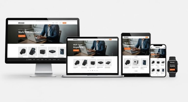
With the rapid increase in mobile device usage, mobile optimization has become a crucial aspect of web design. Websites that are not optimized for mobile devices risk losing visitors, as slow load times, poor navigation, and hard-to-read text can drive users away. In today’s competitive digital landscape, it’s essential to ensure that your website provides an excellent user experience across all devices, especially mobile. Google’s shift to mobile-first indexing has made mobile optimization even more important, as search rankings are now based on the mobile version of your site. This guide explores the key elements of mobile web optimization and offers practical advice for improving mobile user experience.
Why Mobile Optimization is Crucial for Web Design
The importance of mobile optimization cannot be overstated. With mobile web traffic exceeding desktop traffic in many regions, ensuring that your website is optimized for mobile users is essential for maintaining high engagement rates. A mobile-friendly website ensures that users can easily navigate your site, view your content, and perform actions such as purchasing or contacting you. Additionally, mobile optimization can improve your search engine rankings. Google’s mobile-first indexing means that websites optimized for mobile are more likely to rank higher than those that are not.
Key Elements of Mobile Web Optimization
- Responsive Design: Responsive web design allows a website to adjust its layout and content based on the screen size of the device. This ensures that users have a seamless experience, whether they are browsing on a smartphone, tablet, or desktop computer.
- Page Speed Optimization: Mobile users expect fast-loading websites. If your site takes too long to load, users are likely to leave. You can optimize your website’s speed by minimizing large files, compressing images, and leveraging browser caching.
- Navigation and User Experience (UX): Mobile users typically interact with websites using touch gestures, so it’s important to ensure that navigation is intuitive and easy to use. Simplify menus, use large, touch-friendly buttons, and ensure that all interactive elements are easy to tap.
Common Mobile Design Mistakes to Avoid
While designing a mobile-friendly website, it’s easy to make certain mistakes that can harm the user experience. Here are some common mistakes to avoid:
- Unoptimized Images: Large images can significantly slow down your website, especially on mobile devices with slower internet connections. Compress images and use formats like WebP to ensure faster loading times.
- Text Readability Issues: Text that is too small to read or improperly formatted can be frustrating for mobile users. Use larger font sizes and ensure that text is well-spaced for easier reading on smaller screens.
- Poor Touch Target Sizes: Buttons and links that are too small or too close together can make it difficult for users to interact with your website on mobile devices. Make sure touch targets are large enough for users to tap easily.
Tools and Techniques for Mobile Optimization
To ensure that your website is mobile-optimized, it’s important to use the right tools and techniques. Here are some of the most effective tools for mobile optimization:
- Mobile-Friendly Test Tools: Google’s Mobile-Friendly Test tool allows you to check if your website is mobile-optimized. It provides suggestions for improving mobile usability.
- Google Lighthouse: Google Lighthouse is a comprehensive tool for auditing website performance, including mobile optimization. It offers valuable insights into areas like performance, accessibility, and SEO.
- Accelerated Mobile Pages (AMP): AMP is an open-source framework that helps improve the speed of mobile pages. It simplifies HTML and JavaScript to ensure faster loading times on mobile devices.
Mobile-First Indexing and SEO
Google’s mobile-first indexing means that Google now uses the mobile version of your website for ranking purposes, even for users on desktop devices. This shift makes it crucial to prioritize mobile optimization when building or updating your website. Here are some tips for optimizing your site for mobile SEO:
- Mobile-Friendly Content: Ensure that your content is easily accessible on mobile devices. Avoid using Flash, and make sure your text is readable without zooming in.
- Mobile Redirects: Avoid using redirects that only apply to mobile users. Ensure that mobile visitors are redirected to the mobile-optimized version of your site, but don’t block desktop users.
- Structured Data: Implement structured data on your mobile site to help search engines understand the content of your pages and improve your visibility in search results.
Real-World Examples of Effective Mobile Optimization
Many businesses have successfully optimized their websites for mobile, leading to improved user engagement and higher conversion rates. Here are some real-world examples:
- Amazon: Amazon has a highly responsive mobile design that allows users to browse, shop, and check out seamlessly on any device. Their mobile site is fast, with an intuitive interface that prioritizes user experience.
- Netflix: Netflix has optimized its mobile app and website to provide high-quality streaming with minimal loading time. The app automatically adjusts to different screen sizes and internet speeds to ensure smooth playback.
- Airbnb: Airbnb’s mobile site and app provide a user-friendly experience, making it easy for users to search for properties, book accommodations, and manage their reservations on mobile devices.
Conclusion
Mobile optimization is no longer optional; it’s a necessity for web designers and businesses looking to provide an excellent user experience and improve their search engine rankings. By focusing on responsive design, page speed optimization, and intuitive navigation, you can ensure that your website performs well on all devices. Avoid common design mistakes and use tools like Google Lighthouse and AMP to improve mobile performance. With Google’s mobile-first indexing, prioritizing mobile optimization will help you stay ahead of the competition and drive more traffic to your site.


